
Carousel Design Guide
4 Instagram carousels. 4 completely different visual languages.
Same goal every time: stop the scroll, hold the swipe, earn the save. None of these four posts share a single design device — that's on purpose. Below: what each one is doing, the structure underneath all four, and a small tool at the end to work out your version — not a copy of anyone else's.
Why most Instagram carousel design looks identical
Open ten "carousel templates" and you'll see the same slide: a bold sans headline, a soft gradient, a rounded card. It's not that the template is badly made — it's that a thousand other accounts are using the exact same one, so nothing in it reads as a choice. The four carousels below are built the opposite way: each one borrows its entire visual language from somewhere outside social media — a design tool, a museum label, a movie poster — so it can't be mistaken for a template, because templates don't come from those places.
The payoff shows up in the numbers too. Carousels already out-earn most other formats on saves and revisits — Socialinsider's 2026 Instagram benchmark report puts carousels at the top of the engagement leaderboard, ahead of Reels and single images. A distinctive visual language is what makes someone actually swipe through all ten slides instead of tapping past the first one.
 Hover to peek inside
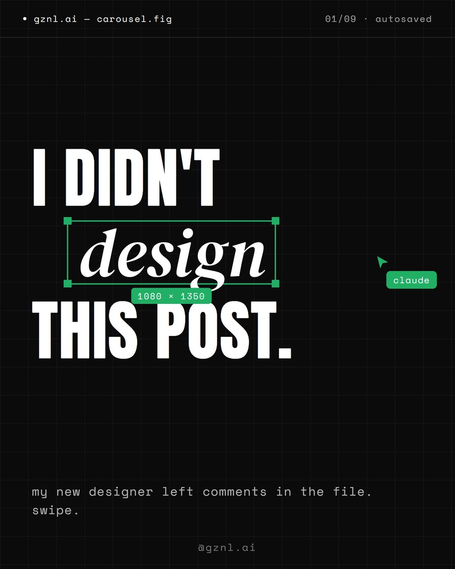
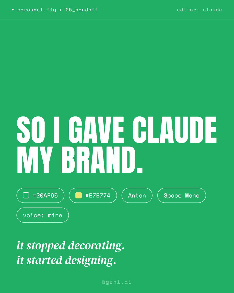
The post pretends to be a leaked design file
The whole carousel is styled like an open Figma tab — dark canvas, selection handles, a labeled cursor, a comment bubble sitting in the corner like someone actually left feedback. It doesn't look like an Instagram post at all, which is exactly why it stops a thumb: it reads as something you weren't supposed to see.
 Hover to peek inside
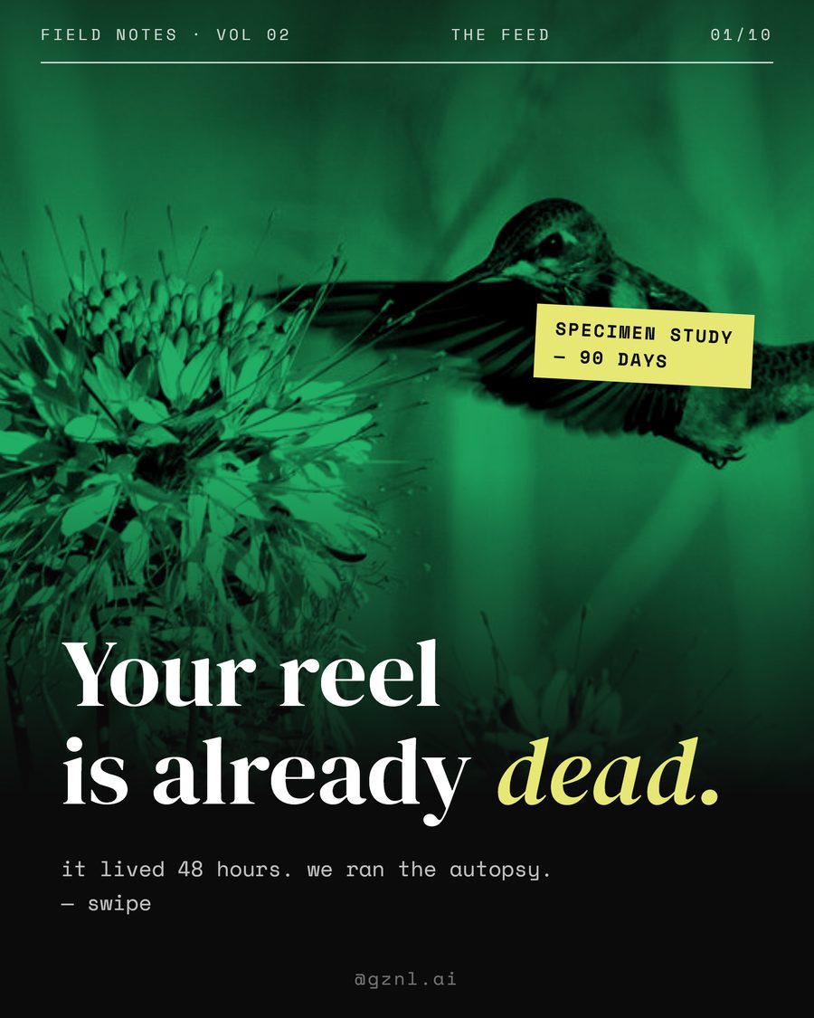
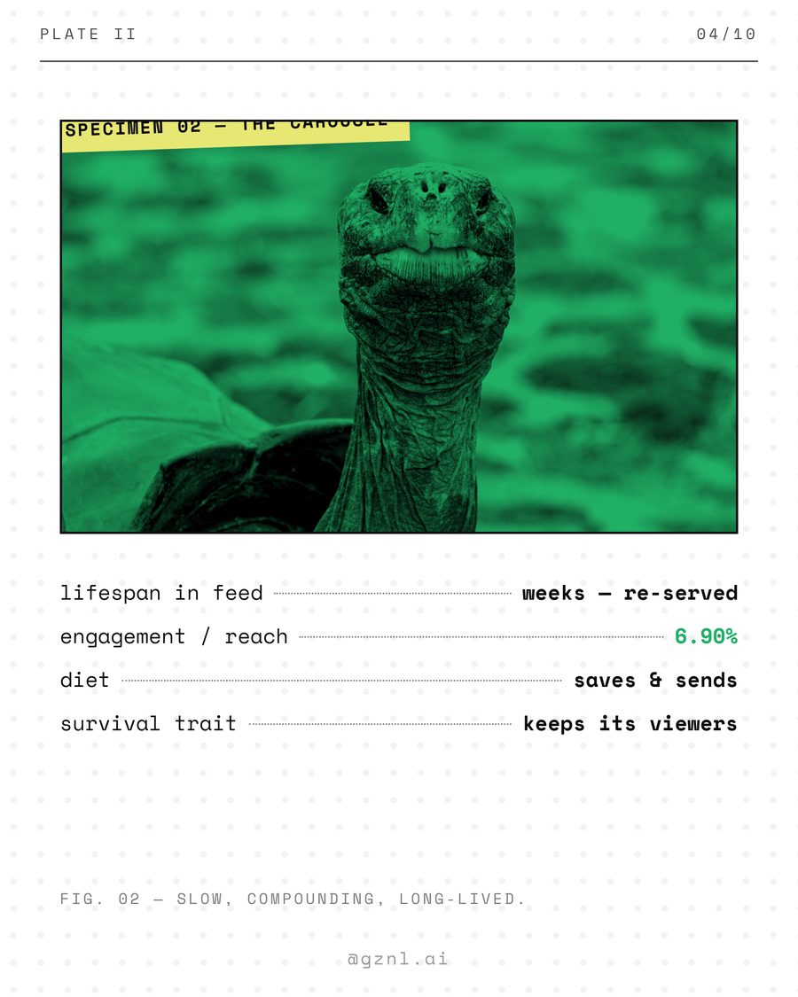
The comparison is dressed as a scientific specimen study
One duotone photo treatment runs across every slide — the same green wash, the same grain — so ten separate images read as one continuous plate from the same field journal. Plate numbers, taxonomy-style labels and a "90-day specimen study" framing turn an ordinary content comparison into something that looks like actual research.

 Hover to peek inside
Slide one impersonates the cliché it's about to destroy
The cold open looks exactly like the generic "10 AI tips ✨🚀" post everyone has scrolled past a hundred times — on purpose. It tears open on the next slide into massive, unapologetic type and a single graded image, arguing that raw AI output is the "slop" and a deliberately art-directed version is the "taste." The contrast between slide one and slide two is the argument.

 Hover to peek inside
A found-footage moment, framed like a vintage film poster
Grainy black-and-white, a proper film credit block, letterboxed inside slides with silent-film intertitles — the entire carousel borrows the grammar of a movie poster instead of a marketing graphic. One ordinary, slightly self-conscious photo becomes a scene from something, just by changing the frame around it.
The method behind all four
Different languages, same four moves underneath. This is the transferable part — the part that works no matter what visual world you pick.
1
Pick a world, not a template
Interface, field journal, statement typography, cinema — or invent your own from somewhere outside social media entirely. Commit to it completely for this one post, then retire it. A language used twice starts to feel like a template again.
2
Build in six beats
Cold open (the hook) → mirror (name where the reader is right now) → setup (the idea) → rhythm (a loud slide, then a quiet one) → the turn (the reveal) → payoff + CTA. Eight to ten slides is the sweet spot.
3
Lock a tiny system
Two or three fonts, one accent color used sparingly, one photo treatment applied to every image without exception. The restriction is what makes ten slides read as one object instead of ten random images.
4
End on an inevitable word
Not "link in bio" — a single keyword that only makes sense for this concept. A specific word turns a passive like into an active comment, and comments are a stronger signal than almost anything else you can do on a post.
Find your own style
This box is the control panel, not a mood board. Pick the world that fits, set your own colors, add your brand and vibe — then hit build and it writes a ready-to-paste carousel studio setup for you down below. That's the part that turns a design into a machine.
↓ this writes your ready-to-paste Claude Project setup in the next section.
Turn it into your own carousel studio
Here's the move that changes everything: you don't design these one at a time. You set it up once as a Claude Project — a reusable studio that already knows your brand — and from then on you just say "I need a carousel about ___" and it hands you a finished one. The box above isn't a preview. It's the control panel: pick your language, colors, brand and vibe up there, press build, and it writes all three fields below for you to paste in.
My Carousel Studio
Builds signature Instagram carousels for my brand — a new visual language every time, on a locked brand system, 6-beat story structure and comment-keyword CTAs, at 4:5 / 2160×2700.
You are the design director for my brand. When I say "I need a carousel about ___", deliver a complete Instagram carousel — designed, written and ready to export. Ask at most one question; prefer zero. Surprise me.

1 · NEW VISUAL LANGUAGE EVERY TIME
Each carousel borrows a completely different visual world from OUTSIDE social media — software interfaces, field-journal specimen plates, brutalist statement type, vintage cinema, risograph print, blueprints, boarding passes, newspapers, receipts, museum labels, tarot, sheet music, or anywhere stranger. Invent the specific devices yourself inside that world — never copy a device 1:1 from a reference you've seen (a comment bubble, a specimen plate, a torn poster, a film credit block are examples of the idea, not a recipe to reuse). Once a language is used, retire it forever. Two posts must never look like the same template — and never like each other's.

2 · LOCKED BRAND SYSTEM
Colors: my primary and accent colors, with the accent kept scarce — about one hit per slide. Keep the overall feel true to my brand. Max 2–3 fonts. Treat every photo the same way (one duotone or one grade) so all slides feel like one object.

3 · STORY IN 6 BEATS
Cold open (hook) → mirror (name where the reader is right now) → setup (the idea) → rhythm (a loud slide, then a quiet one) → the turn (the reveal) → payoff + CTA. 8–10 slides, 4:5 ratio.

4 · CTA
End every carousel with ONE comment keyword born from that concept, never reused. Format on the last slide: comment WORD → what they get.

5 · QUALITY BARS
Design at 1080×1350, export at 2160×2700. Text never touches the edges. Every slide must read clearly at thumbnail size. If it looks like a template or a Canva post, redesign it — taste is the product.

6 · NO REFERENCES NEEDED
Assume no mood board or reference file has been attached — hold yourself to the quality bars above from taste alone. Deliver your most surprising, fully-committed version first; don't hedge, don't offer a "safe" draft to approve. Only revise if I say it isn't working.

Give me one short concept pitch (language + idea + keyword), then go straight to the build.
Build from the box above and all three fields personalise to your brand, colors and vibe. The one rule that keeps your feed from ever looking templated: every carousel uses a new visual language, then retires it.
Quick answers
What size should an Instagram carousel be?
Design each slide at 1080×1350 (a 4:5 ratio) and export at 2160×2700 so it stays crisp on modern phone screens. 4:5 is the tallest ratio Instagram will display in full without cropping, which matters when a slide's bottom line carries part of the message.
How many slides should a carousel have?
Eight to ten. Enough room to build a real cold open, a mirror, a setup, a turn and a payoff without the swipe-through rate collapsing. Fewer than six and there's no room for rhythm; more than twelve and most people drop off before the payoff.
What is a comment-keyword CTA, and why use one instead of "link in bio"?
It's a single word — CLAUDE, CAROUSEL, TASTE, FRIEND, whatever fits the concept — that a reader comments to get something in return. It converts a passive scroll into an active comment, and comments carry more weight with the algorithm than likes or saves alone. The word should feel inevitable given the post, not generic.
Do I need Figma or Canva to design carousels like this?
No. Any tool works as long as the visual language and the 6-beat structure hold — Figma, Canva, Photoshop, or a plain HTML file sized per slide and screenshotted. The tool matters far less than committing fully to one borrowed visual world per post.
How do I choose a color palette that doesn't feel generic?
Start from the visual world, not a color wheel — a field-journal post wants duotone quiet, a statement post wants one loud accent on black or white. Use the style worksheet above to lock a primary and accent color, then keep the accent scarce: one strong hit per slide, not a rainbow.
Can I get Claude to make these carousels for me automatically?
Yes — that's what the studio setup above is for. Create a Claude Project, paste in the title, description and instructions it generates for your brand, and from then on you just say "I need a carousel about ___" and it returns a complete, on-brand carousel using a new visual language each time.